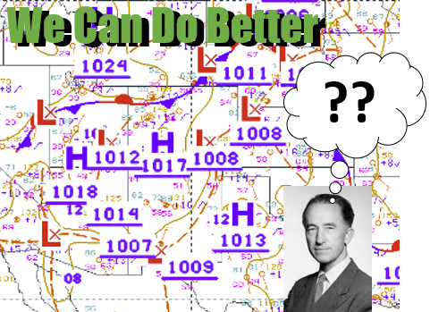
Take a look at the weather map below – what’s the first thought that comes to mind?
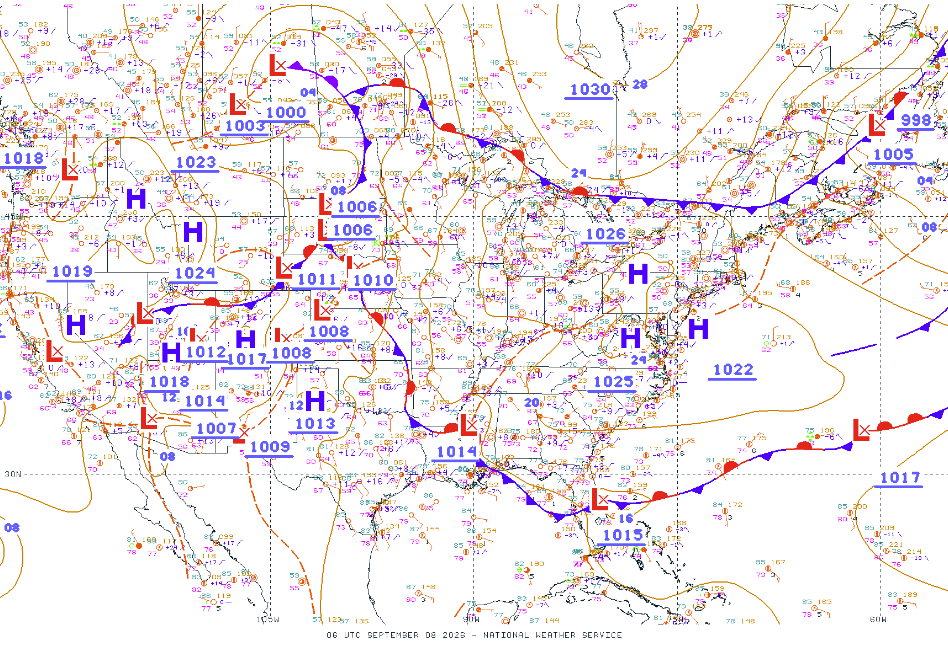
This is the ‘Unified Surface Analysis’ chart, a real-time visualization of surface weather conditions. The chart is created through a collaboration of analysts and forecasters across the National Weather Service National Centers for Environmental Prediction (NCEP) – the Weather and Ocean Prediction Centers and the National Hurricane Center – and the Honolulu forecast office. Common features shown on a surface map are cyclones (L), anti-cyclones (H), fronts, troughs and ridges, and a pressure analysis (i.e. isobars).
As a college professor for two decades, I have used this chart and variations of it hundreds if not thousands of times for instruction and daily weather briefings. I do not have first-hand knowledge on exactly how the maps are made, but I know there are both humans and automated analyses applied to the data. What I am certain of, however, is that this map and others like it need help.
Failure to Communicate
Clarity is a common attribute of effective weather maps. The unified analysis shown above is anything but clear. It appears that the underlying computer interpolation routine goes bonkers with the identification of localized pressure maxima and minima (the blue H’s and red L’s on the map). I count nine anti-cyclones and seventeen cyclones shown. This creates a massive amount of clutter when one also considers the large font pressure labels that go with each letter. And what is going on with the southwest U.S.? There’s multiple Highs and Lows seemingly in the same zip code.
Even more concerning is how this tendency to label every little mound and valley of pressure violates the spirit of the Bergen School’s Norwegian model for synoptic-scale systems. In my humble opinion, Highs and Lows should represent synoptic-scale (systems hundreds of kilometers in size that last several days). Smaller scale meso- and micro-lows and highs – if they are indeed real and not computer artifacts – belong on more detailed regional maps, not on continental analyses. This change would immediately enhance the clarity of the product.
Enough Station Models Already
Also included on the unified analysis by default are individual surface station models. If you’re not familiar, station models are graphical representations of weather station data at that location. At minimum they will include temperature, dew point, cloud cover, wind direction and speed, and sea level pressure. They are designed to fit a lot of data onto a map with little space. However, their inclusion on this map further overloads the senses with tiny, unreadable fonts and numerous colors. Many station models overlap one another, making it difficult at best to parse out what they say. The Ocean Prediction Center does offer an analysis without the station models, but it still suffers from the same overambitious computer interpolation issue.
I asked my wife the first thought that entered her mind when she looked at the map above. She’s not a meteorologist but has been with me for awhile and is vaguely familiar with highs, lows, and fronts. Her response was, “It looks like someone vomited letters onto the screen.”
National Hazard Map Oh My
The NWS tends to make products that include a lot of information but are not optimized for general consumption. Another example that comes to mind – and one that may be the subject of another article, is the national hazards map. Ever want to know every single hazard watch or warning in place for every U.S. county at one time? I didn’t think so. Here’s an example from December 2013:
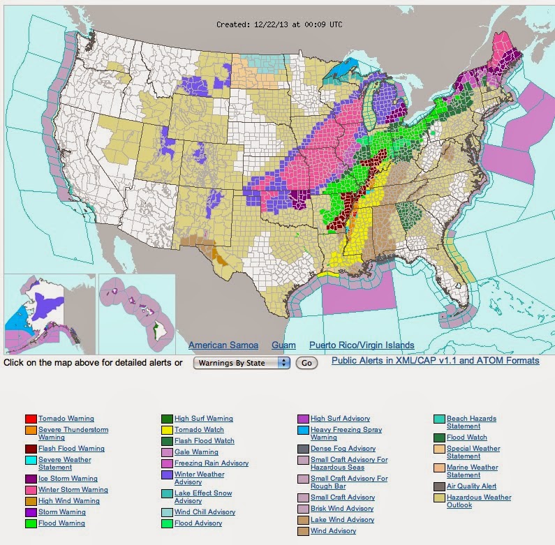
You have to have a Ph.D. in Colors to be able to interpret which of the 540 hazards is being experienced. It’s good to know that Pryor, OK is under a storm warning – or is that an ice storm warning? High Surf Advisory?? Maddening.
Being More User Friendly
I get it, there’s a lot of information you’d like to convey and not enough space to fit it all. It reminds me of professors that insist on getting through every single detail on quasi-geostrophic theory down to the quantum physics of nitrogen atoms that students aren’t able to take home the basic (and usually sufficient) knowledge they need. Know your audience! These products, I assume, are meant for the public. So transmit the most important data/information and give the user the choice if they want more. Take a look at the same surface map from the Weather Underground, a private meteorology company:
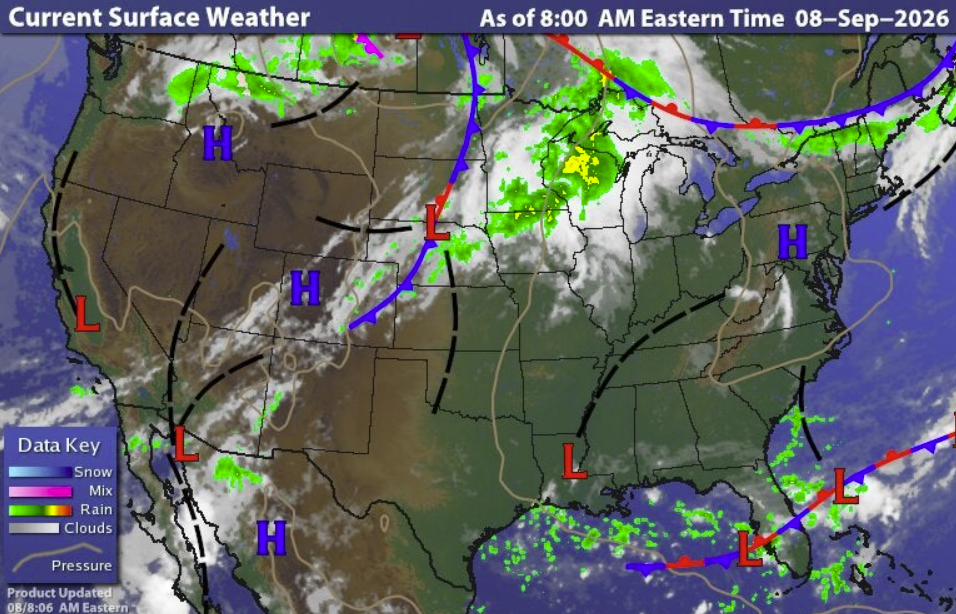
They focus on the main weather makers: cyclones in the northern plains and southern Canada connected by a cold front, disturbances riding along a stationary front in Florida, unsettled conditions in California and the southwest U.S., and high pressure in the east. Throw in a satellite and radar overlay, and you have a clean, effective surface analysis. We don’t need 500 station models, 26 pressure maxima/minima, and intrusive labels.
To be fair, the NWS does offer regional, no station model, and radar/satellite overlays to users (but not on the same image!). The Weather Prediction Center default presentation is much cleaner than the Ocean Prediction Center map above and users can select their preferred flavor of analysis. But why not lead with the cleanest, most useful, and likely accurate map to begin with?
Maybe the NWS can include these optimized products in their new, official mobile app? One can dream…
Dr. Chris Hennon is the Founder and Lead Consultant for Hennon Weather Services LLC. He is a Certified Consulting Meteorologist and former Professor of Atmospheric Science with expertise in Tropical Meteorology and Weather Forecasting.